

A First Look At Fund Website Benchmarking Data
/ TweetDigital marketing success isn’t defined in terms of Website traffic. There’s so much else to consider.
However, benchmarking data on the overall level and composition of your site traffic vis-à-vis your competition can be useful. You’re appealing to the same broad audiences, and their behavior on related sites should have some meaning for you.
 This is a follow-up to last October’s post about the return of benchmarking to Google Analytics. Now there's data to analyze! Here's a first look at it.
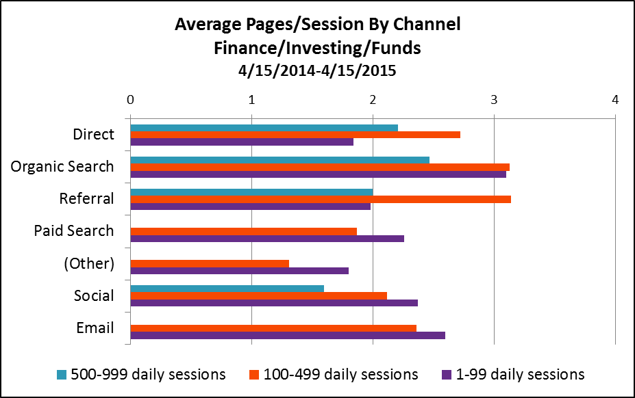
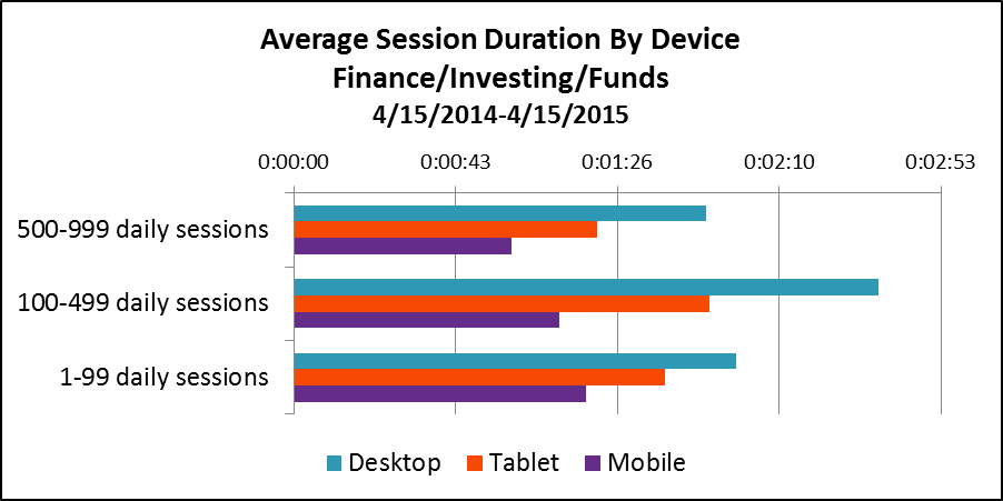
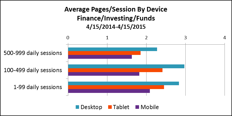
The graphs below reflect 12 months of activity (April 15, 2014-April 15, 2015) on 426 fund Websites whose firms have opted in to share anonymized data to enable benchmarking.
The sites are grouped by number of daily sessions, and the data in the graphs are based on three groups: 0-99 daily sessions (sample=377), 100-499 daily sessions (sample=29) and 500-999 daily sessions (sample=20). Google doesn't yet have a large enough sample to report on fund sites with 1,000 daily sessions and more.
All data can be found in your Google Analytics account. Just go to Audience/Benchmarking. I looked at data at the Funds level (including mutual funds, exchange-traded funds [ETFs] and hedge funds), exported in Excel spreadsheets to be able to work with it.
This is more real (not based on user panels but on actual data that Google is collecting on sites) and more granular (most free benchmarking services stop at Finance or Investing in general, which includes brokerage sites).
Still, the benchmarking will be even more useful:
- When mutual fund and ETF site benchmarking data is able to be reported separately. That can’t happen until a sufficient number of properties agree to contribute data. If your firm hasn't yet opted in, you might want to consider. More on that in my previous post.
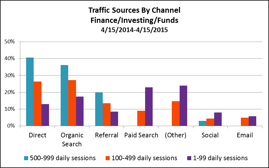
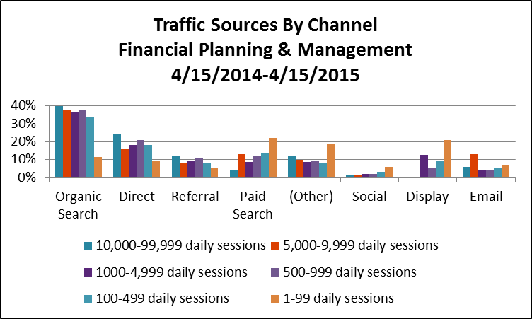
- When some category inconsistencies are addressed. Google has no trouble recognizing direct, search (organic and paid), referral and even social traffic. But if site publishers aren’t using tracking code to distinguish between display and email traffic, Google may mis-categorize it as direct traffic data. You’ll see below that Google benchmarking data is being reported for paid search, other paid traffic sources and email for the less trafficked sites but not for the most trafficked sites.
- When you isolate your own peer group and delve in. I’m presenting the three groups together to get a high level sense of fund company Website traffic in 2015. Compare your site's traffic to your peer group and you’ll learn more.
A Few Takeaways
1. Overall, it looks as if the most that a fund site can hope for are a couple of minutes of the visitors’ time and a couple of pages viewed. This data suggests—let me amend that—makes the argument for easy-to-find content on sites that anticipate the task-oriented visitor. They come, they get, they go. Not that there's anything wrong with that.
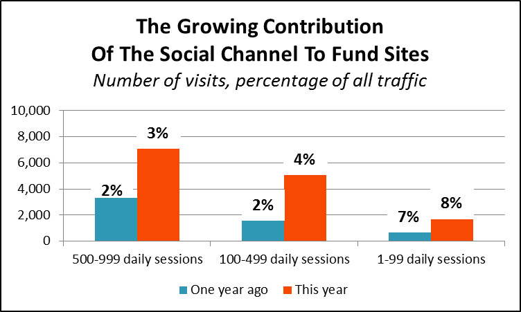
2. Finally, we have data on the contribution being made by social efforts and by email—two areas that there is great interest and investment in.
In fact, see the growth in the total number of sessions driven by social in the most recent 12-month period over the previous period. Benchmarking data is available only from August 28, 2013, so the earlier period comparison is from 8/28/2013-4/14/2014, eight months versus 12.
3. Direct traffic (a reflection of brand awareness and product familiarity), organic search (a measure of content availability, quality and accessibility) and referral links drive the better trafficked Websites. Less trafficked sites rely on paid search, other advertising and organic search.
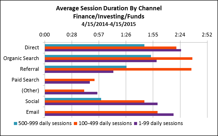
4. There’s a difference in the traffic sourced by each channel: Direct traffic, organic search and referrals lead to more longer-duration sessions, with more pages viewed.
5. Just about one out of four visitors to fund sites comes from non-desktop devices (e.g., tablets or smartphones). This is a remarkable change that has undeniable implications for sites created for desktop use.
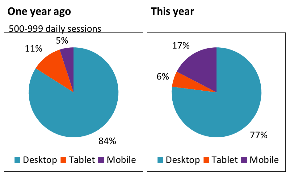
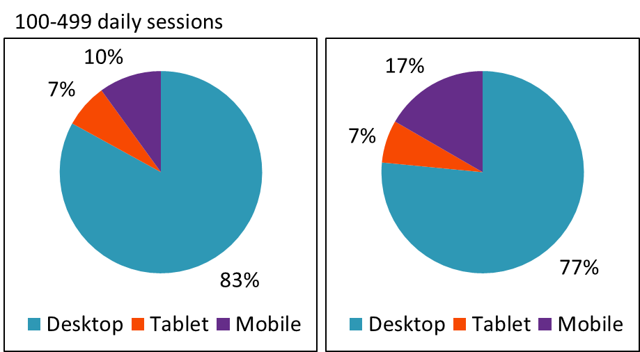
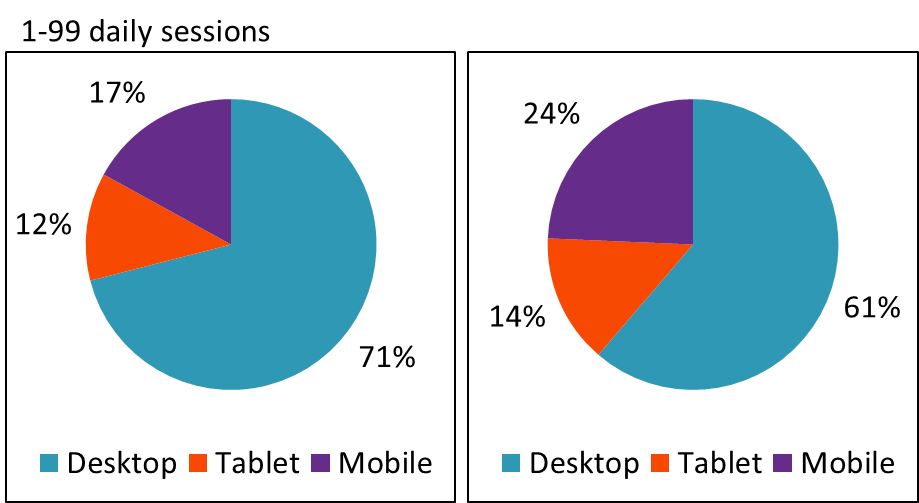
6. Desktop sessions last longer than mobile sessions, which is to be expected. But, there isn’t a big difference in the number of pages viewed across devices. Here too, it’s few pages across the board.
Drilling into your firm’s analytics will help you understand whether this is a good or bad thing. It’s good if you can see that visitors are immediately finding what they need and then moving on. Not so good if the short visits point to visitors—even more frustrated because they're on smaller screens and possibly on the go—who give up.
An Over-The-Shoulder Look At Advisor Sites
Out of curiosity, I also looked at the benchmarking data of sites that are in the Financial Planning & Management category, which together represent about 6,800 Web properties. Nine out of 10 of these attract fewer than 100 daily sessions. Google reports data on sites attracting as many as 10,000-99,999 sessions.
Make no mistake about it—many financial advisors are turning to the same content marketing and paid search tactics that asset manager sites use to build awareness and drive interest. I spotted certified financial planner Jeff Rose ranking for "Roth IRA" searches back in 2010, and more advisors have gotten more serious about inbound marketing since. (In fact, see FMG Suite’s 2015 Inbound Marketing award winners—there are some impressive marketers on that list of financial advisors.)
Few advisory firms may enjoy the brand recognition of your firms or the marketing budgets. The benchmarking data gives us an idea of the organic search strength among financial planning sites.
And there's more—but I'll leave the rest for you to explore.

