

Now For Something Different: Morningstar’s Performance Clock
/ TweetThe old way involved closed doors, guarded discussions and hushed voices until an organization was ready to unilaterally spring change on its business partners and customers. (And we wonder why that didn’t always work so well?)
That’s not how change is introduced today. More often than not, the new way starts with an idea—sometimes not fully baked—and involves pilot tests, trial balloons, beta launches and other forms of vetting by "the crowd."
For example: Have you seen the “performance clock” published in the February/March 2015 Morningstar Magazine? This link will open page 34 of Morningstar’s Nxtbook magazine reader, you might need to give it an extra second or two.
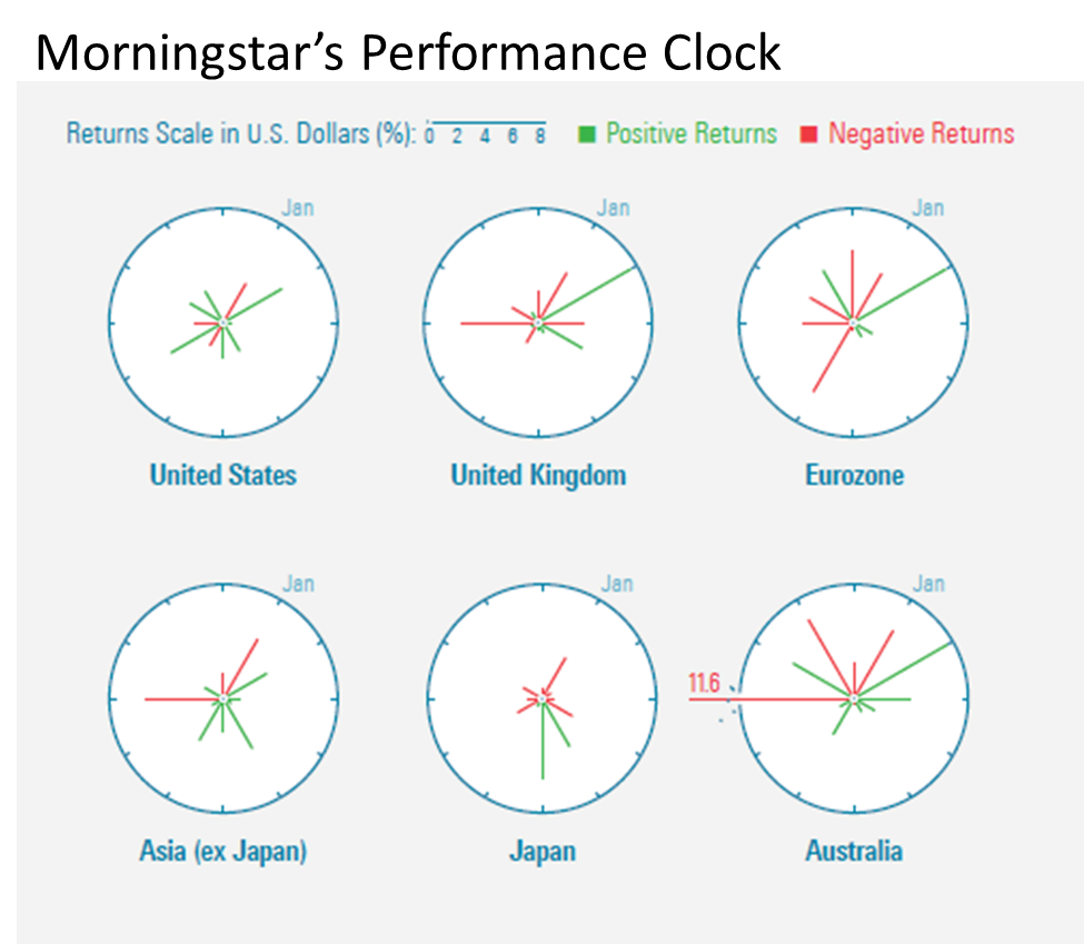
The performance clock offers a different way of looking at monthly returns of indexes or securities over time. It appropriates the face of an analog clock, showing monthly returns for the 12 months of a calendar year. The length of each line shows the absolute performance for each month. January is at the 1 o’clock position. Green lines present positive months and negative months are shown in red. When the returns or losses are small in some months, the lines very short.
“We’re thinking of making it a regular feature in our Data Dashboard toward the back of the magazine,” Editor-in-Chief Jerry Kerns told me in a response to an email I’d sent. “It would track the performance of [market] indexes throughout the year.“
In the note accompanying the feature in the magazine, Kerns asked for feedback, including whether Morningstar software users would want to see an interactive visualization. Per the new way, why invest programming resources unless there’s some demonstrated user interest in it?
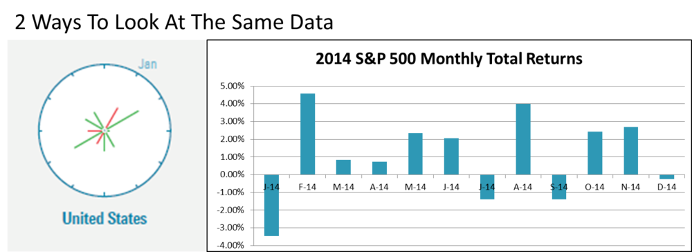
Morningstar acknowledges that the visualization conveys the same information as a standard bar chart. In answer to a direct question from me, Kerns said, “I think it could replace monthly bar charts. It hammers home that volatility comes not just from the downside.”
Kerns elaborated, “I think the clocks work best when they’re being used to compare or provide context. Say that the performance of two funds with similar mandates is correlated—both funds produce positive and negative returns during the same months. But what if one fund was more volatile—its up and down months were more extreme? The performance clocks of these two funds, presented side by side, would show that. The volatility of the one fund would really stand out.”
I like the clocks and found myself spending much more time with them than I would with bar charts. I appreciate new efforts to aid investor understanding. At the same time, I should admit that I’m a pushover for whatever's new.
Does The Clock Toll For You?
Every mutual fund and exchange-traded fund (ETF) marketer knows to keep an eye on what Morningstar’s up to. In fund communications alone, we have Morningstar to thank for introducing the style box (in 1992, according to this corporate PDF) and of course there are the star ratings that appear on most fact sheets and fund profile pages.
I wouldn’t rule out the possibility that a new and improved visualization from Morningstar might eventually influence your presentations of market or fund performance.
Who else has a say in how fund companies present data? The financial advisors who distribute your products, the wholesalers who represent them, FINRA, Compliance, your fund data automation vendor, in-house designers all have a stake, too.
Just to test the waters, I reached out and asked Synthesis and Kurtosys, two marketing communications automation solutions providers mentioned here before—see this post and this—for their reactions. These people are information design professionals, with the battle scars from having to automate scads of data, graphics and text for an array of asset manager communications. They are not easily impressed.
“How would the performance clock work, either in fund fact sheets or online?” was what I wanted to know.
Some Reservations
Stipulated: There’s no doubt that a tabular presentation of fund return data is the most complete information a fund company can provide. If the clock visualization was used to present fund performance and/or index performance, it would likely be supplemental as most fund company graphics are.
Even so, the fund automation vendors have their reservations.
On the plus side, said Synthesis product manager Noel Rodolfo, “One of the benefits of this chart is that it should take up less real estate than a bar chart (even with data labels added, as I would suggest). And the clock hands’ length is the absolute value since positive/negative is denoted with a color. Nice, that will save some space.”
However, Rodolfo noted that reliance on color alone for positive and negative returns will be a challenge for the color blind. Ultimately, he thinks a benchmark comparison—involving two clocks side by side—will be more difficult and take the user too long to analyze the differences.
“I’ve seen these charts used by the fund ‘technicals’ on an institutional level, at French and Swiss firms mostly,” said Matt Stone, marketing director for Kurtosys.
Stone called clock charts interesting but confusing. “They save space and can help report on seasonality, but they are frighteningly hard to read for most. Both the positive and negative values go in the same outward direction.”
Stone said Kurtosys doesn’t see much reinventing of the wheel related to fund performance. On the other hand, marketers are turning to infographics for “the freedom to experiment and be more original. But the aim,” Stone reminded, “should always be to provide clarity, precision and efficiency.”
Your turn—whether you’re a marketer, financial advisor or Other—to weigh in on the performance clock. Your comments are welcome here, of course. You might also want to share your thoughts with Kerns. After all, early response from our crowd should be the benefit of Morningstar’s providing a first look.

